Views: 2509
Chances are, if a story about Russia appears on the cover of a major Western magazine, it’s not good news. Most likely, there’s been an international scandal, a breakout of geopolitical tensions, the resumption of Cold War hostilities, or some nefarious Russian plot to bring the entire free world to its knees.
Russophobia — or the unnatural fear of Russia — generally leads magazine editors to choose the most over-the-top images to convey Russia as a backwards, clumsy, non-Western and aggressively malevolent power. Unfortunately, that’s led to a few rules of thumb for anyone trying to create a magazine cover featuring Russia. You can think of these rules as the dark art of making an anti-Russian magazine cover:
OPTION 1: Go with the Russian bear
This is a no-brainer, actually, and pretty much the default option for any magazine editor. The symbol of the Russian bear is universally understood to be the symbol of Russia, so it’s an immediate attention-grabber that readers will grasp quickly. After all, for centuries, Western satirists have used the Russian bear as a symbol of imperial aggression.
Given the latest round of U.S.-Russian tensions over the Ukraine crisis, the key is to make the Russian bear look as scary as possible. Take the May/June 2016 cover from Foreign Affairs, for example:
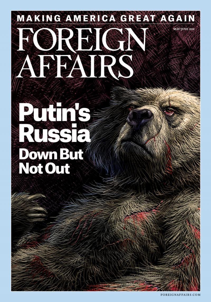
The cover title seems relatively harmless — “Putin’s Russia: Down But Not Out.” But check out the image of the bear — it’s bloodied and still relatively menacing, despite being bruised and battered — check out the red, bloodshot eyes and the sharp claws. Definitely not someone you’d want to mess with, even after a few shots of vodka.
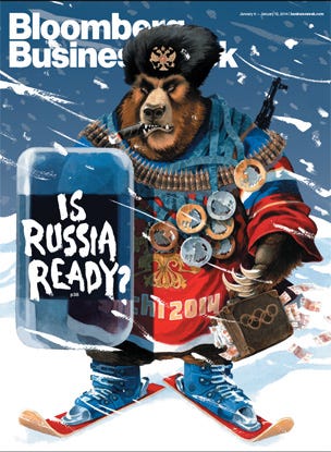
And Foreign Affairs is not the only magazine to go the full bear with the cover. Ahead of the Sochi Winter Olympics in 2014, Bloomberg BusinessWeek went with what has to be the scariest, most menacing Russia bear that’s ever appeared on the cover of a magazine. The magazine shows a malevolent bear on a pair of skis wearing a Russian hockey jersey, armed to the teeth (literally), with the headline: “Is Russia Ready?”
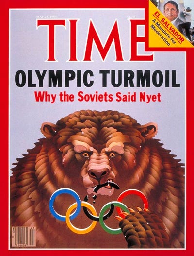
This Olympic cover immediately calls to mind a cover story TIME ran on Russia (then the Soviet Union) ahead of the 1984 Los Angeles Summer Olympics — “Olympic Turmoil: Why the Soviets Said Nyet.” Here you have a menacing (and slightly psychotic-looking) Russian bear chewing on the Olympic rings:
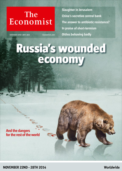
There are other options, of course, if you don’t want to go with the anthropomorphic bear. In late 2014, The Economist pulled off a story about “Russia’s Wounded Economy” after Western sanctions and falling oil prices — it showed a bear stalking through the wintry, Siberian snow with bloody footprints:
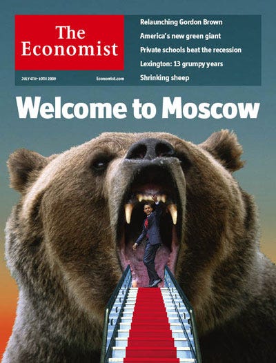
But you probably want to emphasize either the claws or teeth of the Russian bear, right? So here’s a terrifying image of a Russian bear “welcoming” U.S. President Barack Obama to Moscow:
OPTION 2: Go with Vladimir Putin
The next best choice after using the Russian bear is the image of Vladimir Putin. After all, in the minds of most Western readers, Putin is Russia and Russia is Putin.
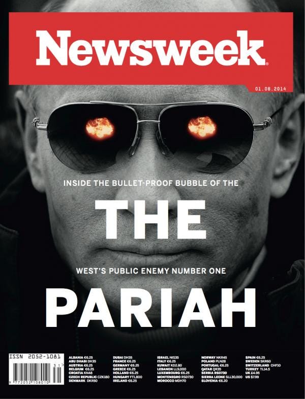
If you’re ready to head down this road, then an image of an evil James Bond villain, hatching a diabolical plot to take over the world, might work. This 2014 Newsweek cover of Putin, showing him and the menacing sunglasses, is a classic:
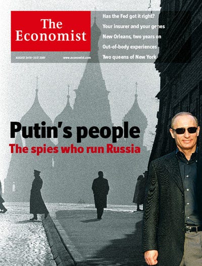
To play up the Soviet spy background of Putin, you could try using an image of him wearing sunglasses in a grim-looking Red Square (Gray Square!):
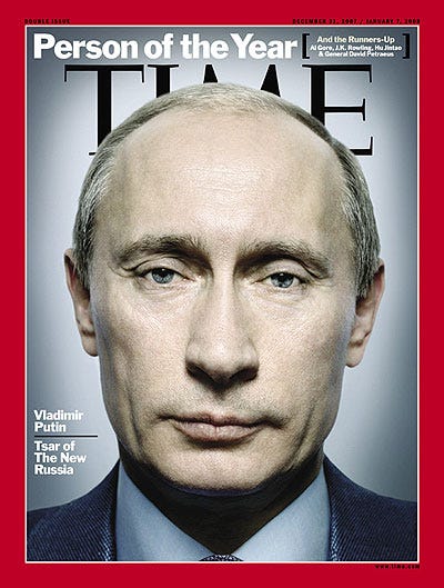
A variant of the James Bond villain look is the classic “moody Putin” look that’s been around for almost a decade. This image somehow captures the Western perception of Russia as a vast, unsmiling wasteland full of snow, ice and a vast moral void. Who better to run that country than an unsmiling dictator? What started it all was this TIME magazine cover naming Putin as “Person of the Year”:
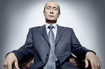
From there, the moody, unsmiling Putin image took off. Pull your camera angle back from the close-up of Putin’s face and you get this — “the unsmiling tsar”:
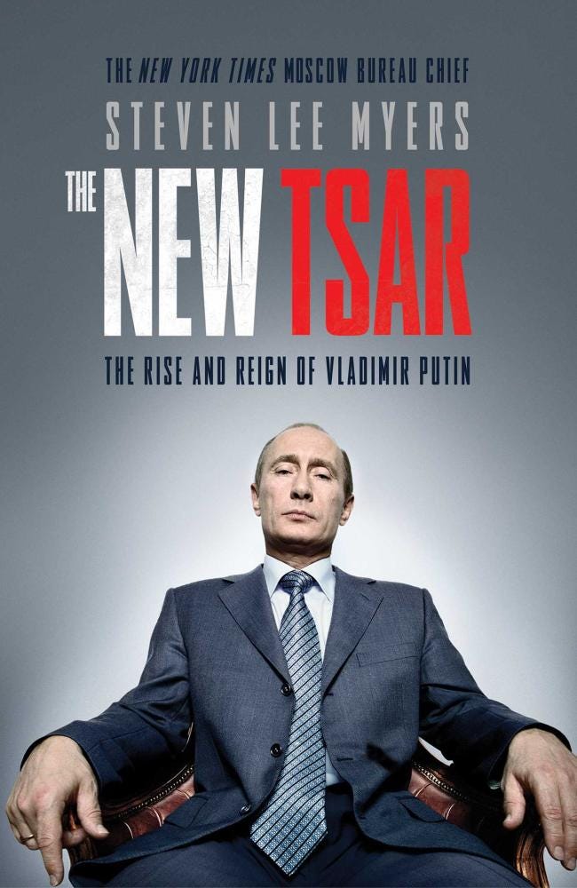
Which, of course, led to the cover of this 2015 book by Steven Lee Myers of the New York Times:
Of course, the moody, unsmiling, sour-looking Putin can be updated to make him look like a gangster:
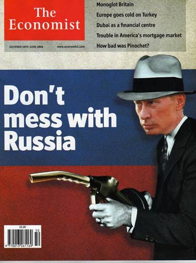
Or a Mario Puzo-style mafia don:
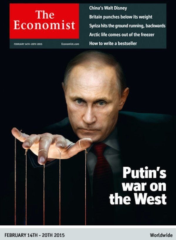
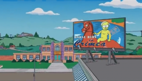
If you really want to grab the reader’s attention, though, go for the shirtless Putin. The shirtless Vladimir Putin is a classic Internet meme, of course. (Google: Shirtless Putin hummingbird hamster) The meme of a shirtless Putin doing manly things is so popular that “The Simpsons” even used the image of a completely naked Putin on horseback (bareback?) around the time of the Crimea crisis:
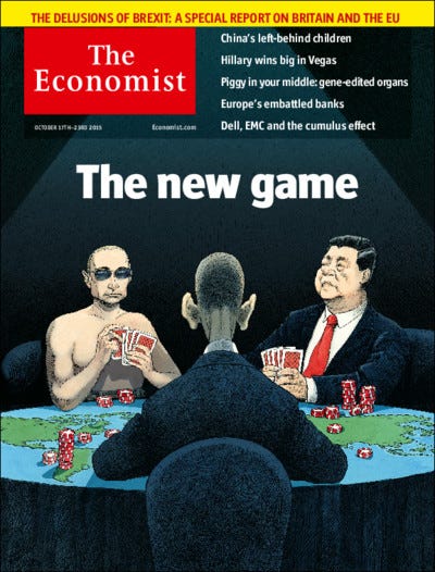
Look long enough, and you start to see images of shirtless Vladimir Putins Photoshopped on top of everything. So it’s perhaps no big surprise that the shirtless Vladimir Putin has ended up on the cover of a few major magazines, including this classic Economist cover where he’s shirtless on top of a Russian tank:

And shirtless while playing poker:
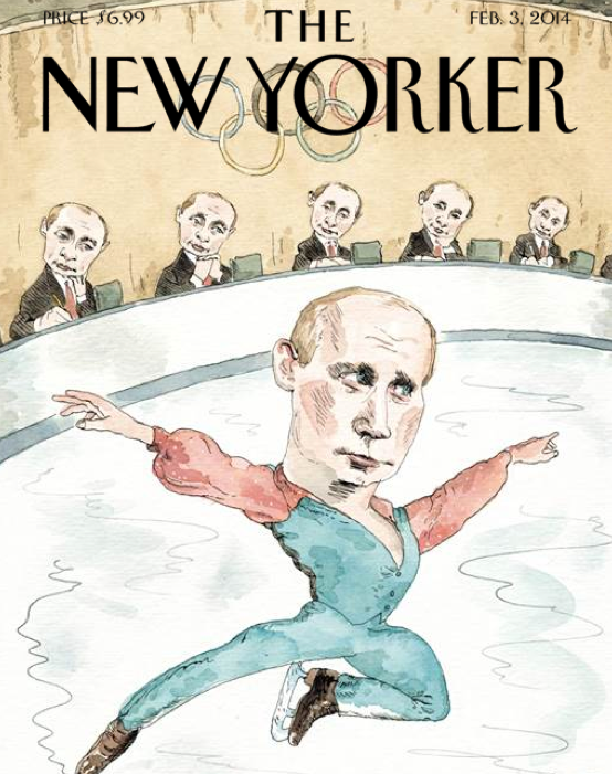
But, if you want an image of Putin, and you also want to keep things classy, how about a mashup of Putin and a classic symbol of Russian culture, like ballet or ice skating? In 2014, The New Yorker pulled off a cover of Putin, pirouetting through the air during the Sochi Winter Olympics, while a bunch of Putin yes-man clones give him top marks for his performance:
And, here’s another cover featuring Putin as an ice skater, this time from The Economist:
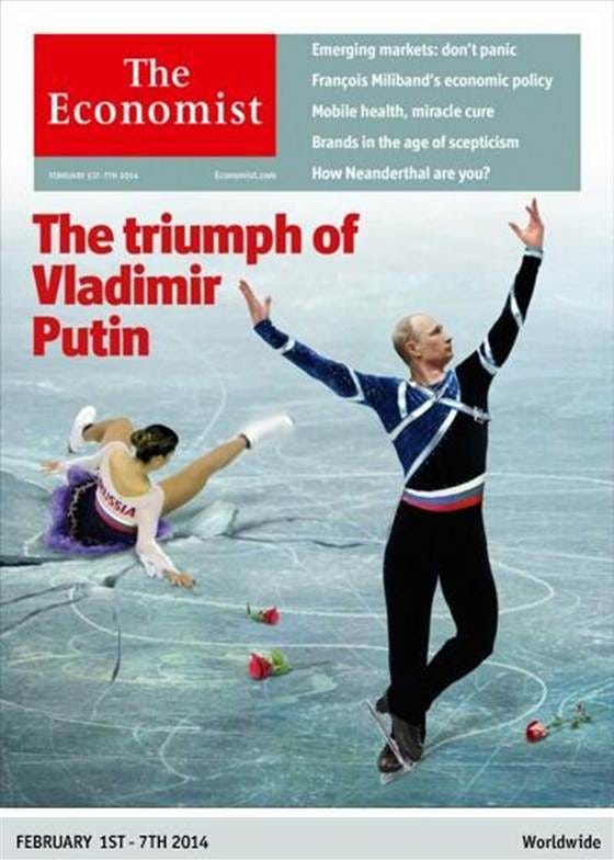
But here’s the twist — note the fallen Russian figure skater on the ice and the suggestion that the Sochi Olympics were basically a giant personal ego project for Putin. (Also note the subtext of the imagery — whereas Putin usually opts for “macho” sports like hunting, swimming and hockey, this cover shows him as a slightly effeminate ice skater. Look at the hands!!!)
OPTION 3: Go with a classic image of Russia, slightly twisted
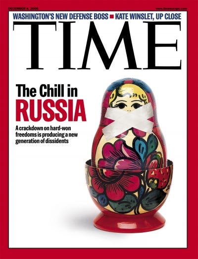
If you’re tired of using the Russian bear image and you’re concerned that putting Vladimir Putin on the cover of your magazine might create a few unsavory possibilities for your editorial team (Russian spies! Russian mafia! Russian hooligans!), there’s the old standby — the matryoshka image. This, of course, conveys the enigmatic nature of Russia — the old “riddle inside an enigma wrapped in a mystery” of Winston Churchill:
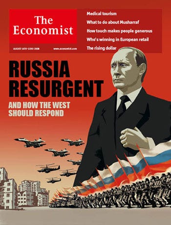
But why stop there? To convey the threatening nature of all things Russia, maybe it’s just easier just to come out and show the Russian missiles, tanks, weapons and troops directly:
What all these magazine covers have in common, of course, is their Russophobia. These magazine covers are not so much different from the images that appeared a hundred years ago, when Russia really was an enigma unknown to the West. In fact, the image of Russia as a big, clumsy and aggressive state dates all the way back to the 16th century, and not much seems to have changed since then.
There’s always been a sense in Western media circles that a giant power in the middle of the Eurasian landmass posed a threat to someone — and maybe to everyone:
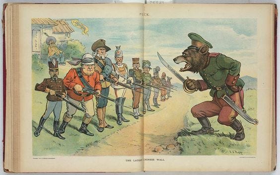
Although, in all fairness, the image of the Russian bear is probably preferable to the image of the Russian octopus:
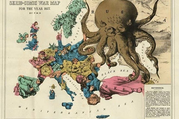
Which leads to the obvious question — Are these images of Russia from 100 years ago really so much different from the images appearing today in Western mass media?
At a time when the Kremlin has called on the Culture Ministry to investigate anti-Russian propaganda and Russophobia in the West, this question isn’t very hard to answer.
Originally published on 2016-07-10
Author: Dominic Basulto
Soutce: Medium
Origins of images: Facebook, Twitter, Wikimedia, Wikipedia, Flickr, Google, Imageinjection, Public Domain & Pinterest.
Read our Disclaimer/Legal Statement!
Donate to Support Us
We would like to ask you to consider a small donation to help our team keep working. We accept no advertising and rely only on you, our readers, to keep us digging the truth on history, global politics and international relations.
FOLLOW US ON OUR SOCIAL PLATFORMS